The ultimate linkedin profile optimization checklist


A strong personal brand has become more important than ever. And it all starts with a perfectly set up profile.
This article walks you through the different parts of optimizing your LinkedIn profile, ranging from the technical setup of your profile settings to the visual appearance of your profile. It’s all covered.
At the end of this article, you know exactly what you need to do to have an optimized profile that converts your visitors into valuable connections. We are dividing this in three parts:
Part 1: The technical setup
Part 2: Checklist to set up the perfect LinkedIn profile
Part 3: What not to do
Let's get started!
Part 1: The technical setup
Your visibility matters
Have you ever received a connection request from someone who is a gray dot? Is that how others see you? The last thing you want to be on LinkedIn is anonymous.

To prevent a situation like this, you want to check your profile visibility settings first.
Settings
In order to change these settings, you click on your profile picture in the top right corner and head to “Settings and privacy”. Then, in the menu on the left side, you choose “Visibility” and in the first option of that menu “Profile viewing options”, you adjust the following settings.
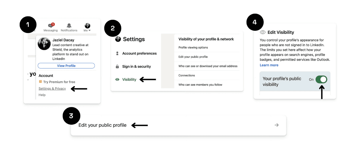
This is how you want your settings to look.
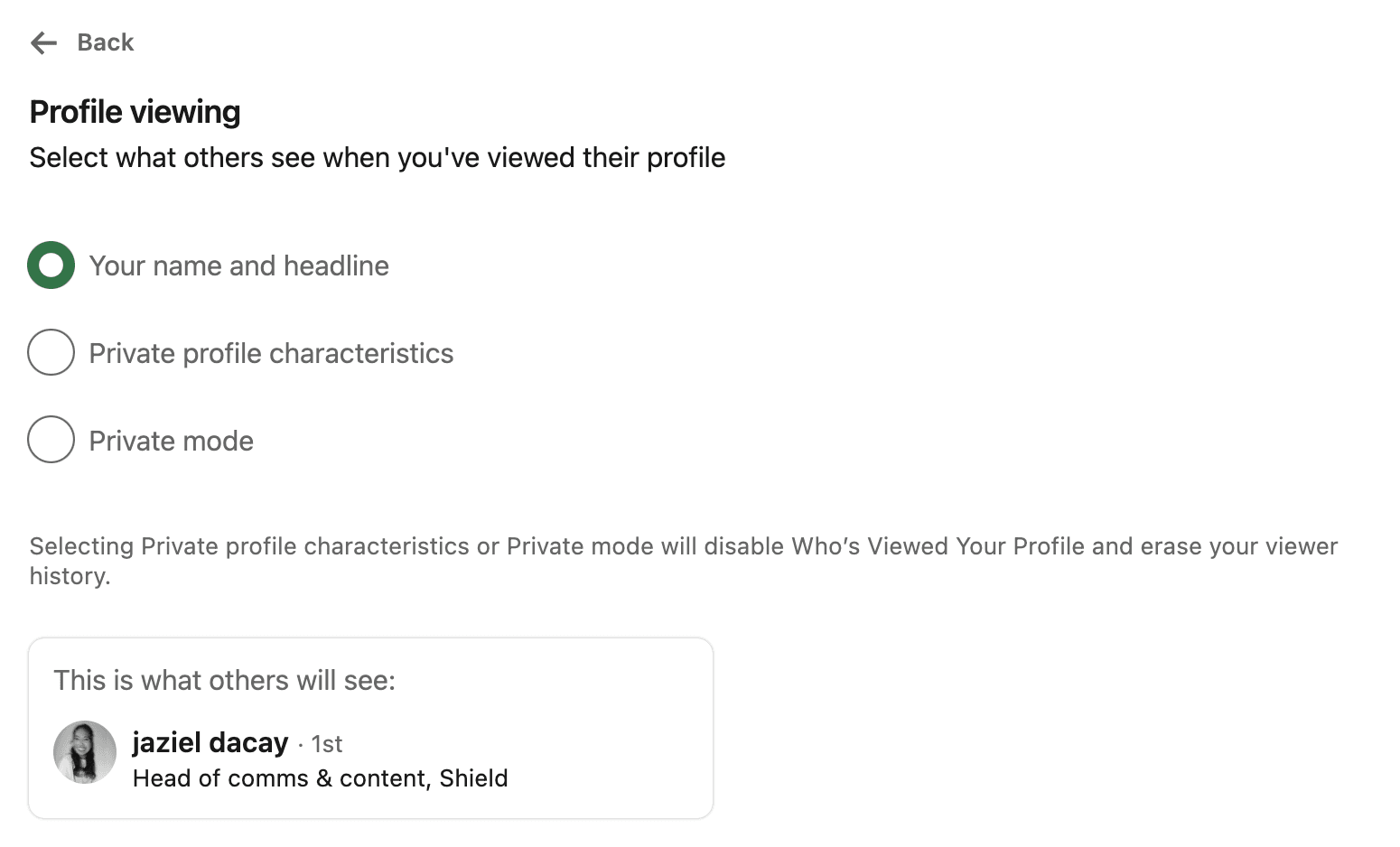
Your personal profile
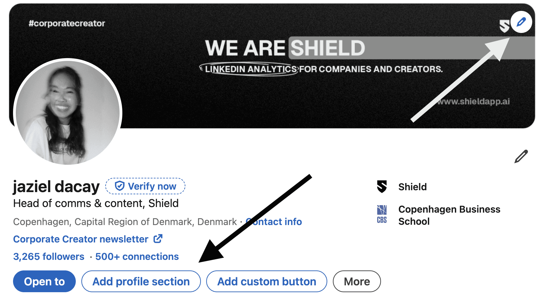
You want to make sure that your personal information is correct. After all, you never know who visits your profile. When you browse your personal profile, you can adjust your details using the edit button on the right side.
By choosing the ‘Add profile section’ you can add more elements to your profile. More on this follows later in this article.
Part 2: Checklist to set up the perfect LinkedIn profile
The second and most important part of this article is a deep dive into your personal profile.
As stated in the introduction, your personal profile is the billboard that talks about you and your expertise.
Your personal profile consists of the following 8 elements.
Headline
Profile picture
Header
About section
Featured articles/posts
Creator mode
Recommendations
Skills assessments
Let’s break them down one-by-one.
1. Headline
Your personal headline is your hook, your opening line. It should catch people's attention and communicate right away what you do. In one impression a visitor wants to see what you’re about. Their subconscious goes: “Why should I care to follow this person?” or “How can this person help me solve a problem I have?”
A general rule of thumb: you want to make your headline more than just a job title.
You want to be as clear and succinct as possible. Even though it’s your profile and headline, it should be about your potential audience. You want to display how your brand can potentially serve them.
A quick checklist to craft a strong headline:
Clearly communicates who are
Communicates who you help and how
Easy to tell what problem you solve
Is mobile-friendly
Is short and catchy
A couple of great examples:
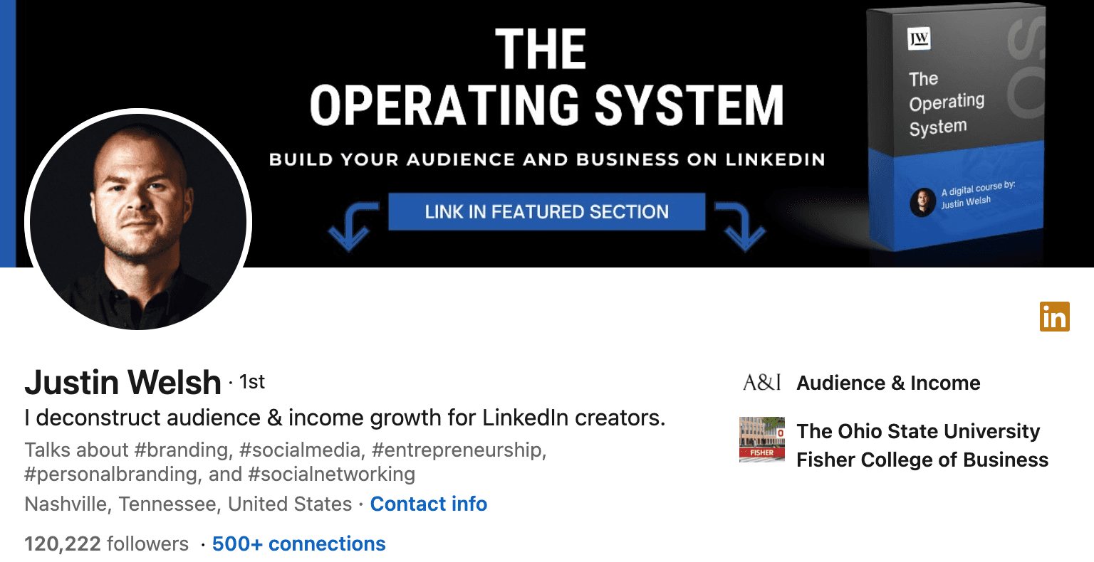
Reading Justin Welsh’s last headline immediately gives the reader clarity on what he does.
It’s the perfect usage of the “I do X for Y” framework, a great way to frame the problem someone is solving and for precisely which audience. Try this with your headline
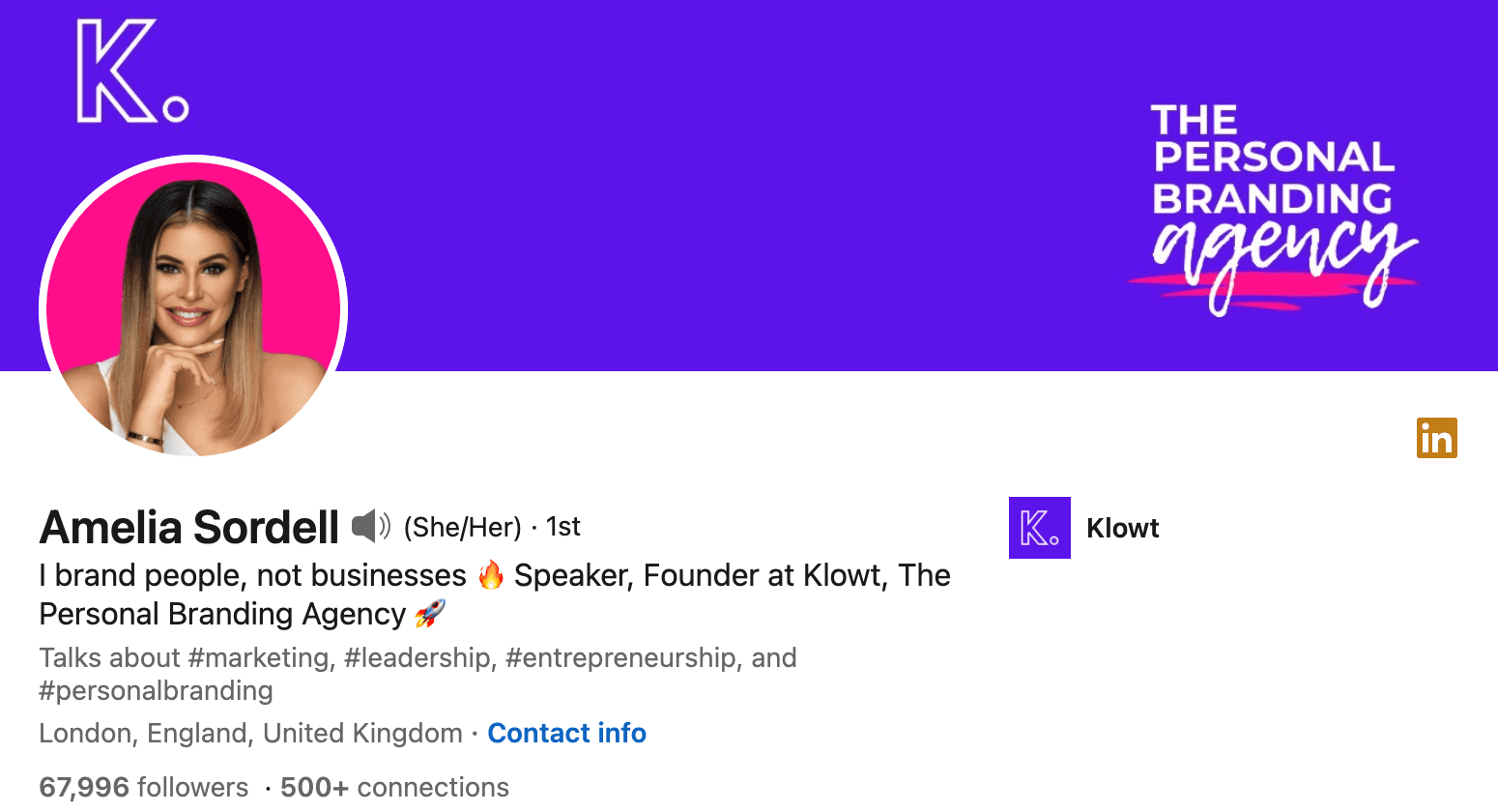
Amelia uses a smart but funny way to showcase her expertise in personal branding. Her bio instantly makes clear which type of audience she solves for (people, not businesses).
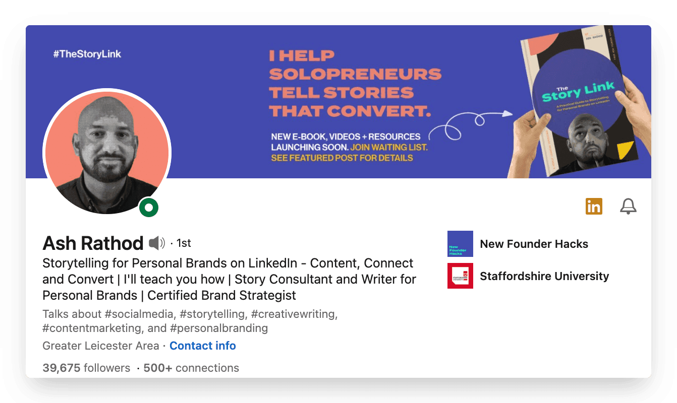
Ash highlights his expertise in his first line "Storytelling for Personal Brands on LinkedIn" and then adds “I’ll teach you how”
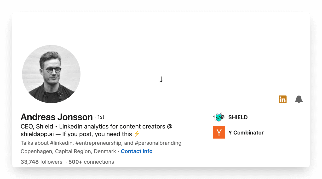
Andreas keeps his headline simple by stating “CEO” and describing the problem his company is solving. This adds curiosity for his audience to check what he's talking about.
2. Profile picture
Your profile picture is the first thing your audience sees. You don’t want to miss this opportunity to impress your audience and show them your best appearance.
We probably cannot help you take the perfect picture but we sure can give you a checklist you can follow
It’s all about the Lighting, Lighting, Lighting
Use a recent picture
Choose a background that's not crowded
Use a high-quality camera. Get a photographer if you can
Smile. It's your best asset!
Use your brand colors in your photos, or as a background
And if your team posts consistently it could be a great idea to have similar brand colours in your background like the team here at Shield does.

3. Header
Your header or the background picture is your free billboard.
Have you ever noticed that it takes up almost a quarter of the page?
It’s a lost opportunity to not utilize this space to build your brand image.
Similar to your profile picture, there isn't one right answer to what your header should look like. Here are 3 aspects you definitely need to take into consideration when picking a header image:
You want to use the banner to display
Personality: Your cover photo is the only other place on your profile that lets you use pictures to express yourself. Use your cover photo to present yourself or your brand to the world aesthetically.
High quality: If you feel a photo that speaks to your hobbies or passions isn't appropriate for your vibe, go for a high-quality photograph that showcases your company. This could be a version of your company's logo that is formatted to fit your banner size, a high-quality picture of your office, or even your team.
Get creative: If you're feeling artsy, you can always create a cover photo. We’re talking about mixing and matching pictures to show your brand, personality, skills, and whatever it may be. The possibilities are endless.
Looking at Shield’s company profile as an example, it’s clear that those elements are well-covered.
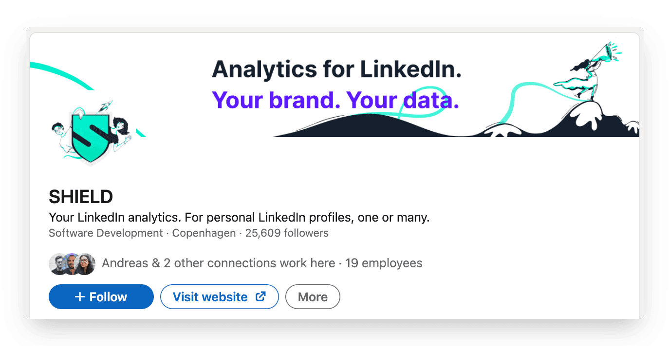
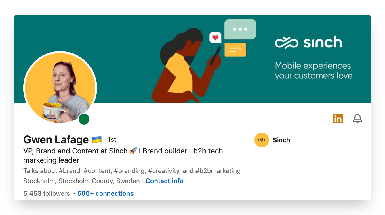
Here's an example of using your company's imagery as your background. Extra kudos to Gwen for matching the color scheme perfectly!
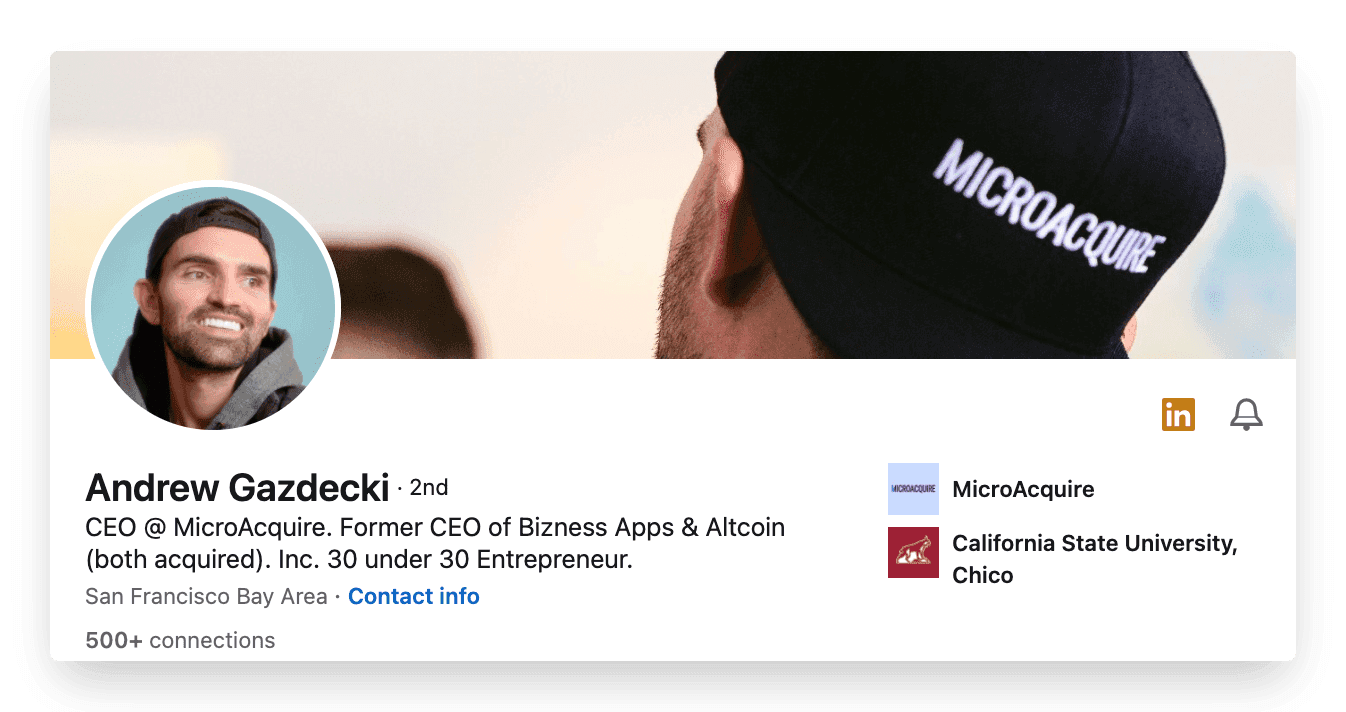
Another great example is the CEO of MicroAcquire, Andrew's header. He creatively uses a picture of him with his brand visible. Cool usage of the header!
4. About section
Also referred to as your summary. This is your chance to highlight anything you want about yourself, your career, your journey, and what your superpower is.
There is just one rule: make sure you have an about section updated. Unfortunately, many profiles are still without a decent summary. Such a waste if you’d ask us.
Your summary is your chance to tell your own story – so don’t just use it to list your skills or the job titles you’ve had.
Try to bring to life why those skills matter – and the difference they can make to the people you work with. Don’t be afraid to invest some time, try a few drafts, and run your summary past people you know. Their feedback can be very helpful. This is your most personal piece of content marketing – and therefore, it’s worth the effort.
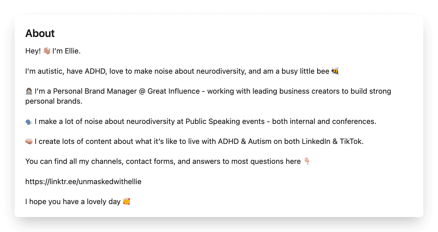
A snippet of the About section of Ellie Middleton, one of the biggest creators on LinkedIn. Click here for the full version.
5. Featured section
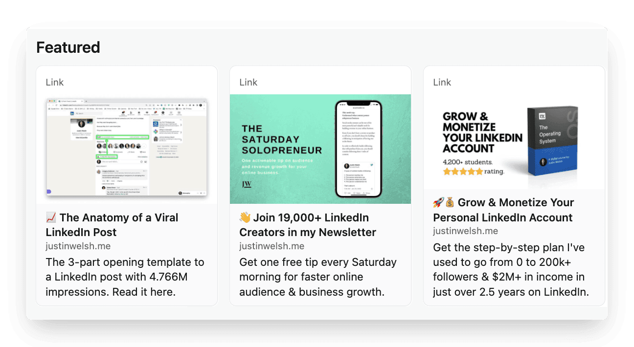
The Featured section gives you the opportunity to showcase work you’re proud of or content that deserves an extra spotlight.
Sharing case studies, white papers and other brand content helps you to show what the brand you build is all about. Besides, it helps people understand your passion and commitment to a certain field as well. To feature a piece of content on your personal profile, you head over to the specific post and click the three dots on the right side. Then, you choose the first option to pin it to your profile.
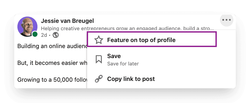
Setting this up strategically, allows you to create a relevant library of content. Here’s an example from Justin's featured section where he posts content from his website.
6. Creator mode
One of the newest features of LinkedIn that helps you grow your reach and influence on LinkedIn. You can turn on creator mode to get access to additional tools and features. This helps to create content and grow your audience base on LinkedIn. When enabled, it shows up to 5 topics you create content about. This is a great feature to impress and convince visitors to follow you. Bonus: Many creators now have the option to add a link to their profile which can lead directly to a website or your chosen destination.
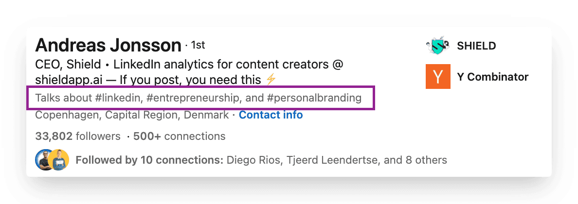
You can find a full list of the benefits of Creator Mode here.
7. Recommendations
Positive social proof gives you a great competitive advantage.
Having great recommendations on your profile gives visitors a quick, visual sense of what you’re valued for. They’re often personal testimonials written to illustrate the experience of others working with you. It’s one of the strongest ways to build trust with your prospects and audience.
It’s easy to reach out to specific contacts and request recommendations by using the drop-down menu in the Recommendations section of your profile. You want to be strategic about who you would most value a recommendation from and therefore, personalize your request.
You can think you’re the best at what you do, but if no one can endorse that, it’s hard to back it up.
8. Skills Assessments
LinkedIn offers you the opportunity to take tests and showcase these skills on your profile. A skills assessment is an online test that enables you to demonstrate the level of your skills, and display a Verified Skills badge on your profile.
Data shows that candidates with verified skills are around 30% more likely to be hired for the roles they apply for. (LinkedIn, 2019) Showing these abilities strengthens your personal brand more generally as well. After all, it's great to set yourself apart from the competition.
Part 3: What not to do
Once you set up your profile on LinkedIn using the checklist, remember the below:
Don't use buzzwords
Don’t shy away
Don’t hide behind a private profile
Don't use buzzwords
Buzzwords are adjectives that are used so often in LinkedIn headlines and summaries that they become almost completely meaningless. Regular rankings of the most overused buzzwords include terms like ‘specialized’, ‘leadership’, ‘focused’, ‘strategic’, ‘experienced’, ‘passionate’, ‘expert’, ‘creative’, ‘innovative’, and ‘certified’.
It’s not said that you can’t describe yourself as these things – or that they don’t matter. However, just using these words won’t convince people that you have these qualities. You need to demonstrate them as well – both in the way you describe yourself and in the way you use LinkedIn profile features to show what you’re about. And the best way to do that is by creating consistent content around your expertise.
Don't shy away
If you’ve worked with someone and done a great job they’ll be more than happy to support you. It’s absolutely OK to ask for recommendations on LinkedIn. You can only receive recommendations from first-level connections so make sure you connect with the right people first. And we recommend even drafting an outline of the recommendation especially when asking someone very busy. Always a good idea to make the other person's job easier.
Don’t hide behind a private profile
LinkedIn is a social network, a place to socialize. It's the best place to meet new professionals from around the world. With this in mind, make your connection list open to connections, make your activity feed open to everyone, and ensure your name and profile picture is openly visible to everyone. If there are some people who you don’t want to share your information with, then they shouldn’t be a part of your network, and you should and can simply remove them as a connection.
Let's wrap it up
Building a strong personal brand is a game you never lose. It’s one of the best ways to set yourself apart from the competition. If you’re serious about growing as a creator, you should take your LinkedIn profile as seriously. After all, it’s the billboard that sells you and your services while you’re asleep.
And once you set up that perfect profile, head over here to read How to write a scroll-stopping post!
See you,
A strong personal brand has become more important than ever. And it all starts with a perfectly set up profile.
This article walks you through the different parts of optimizing your LinkedIn profile, ranging from the technical setup of your profile settings to the visual appearance of your profile. It’s all covered.
At the end of this article, you know exactly what you need to do to have an optimized profile that converts your visitors into valuable connections. We are dividing this in three parts:
Part 1: The technical setup
Part 2: Checklist to set up the perfect LinkedIn profile
Part 3: What not to do
Let's get started!
Part 1: The technical setup
Your visibility matters
Have you ever received a connection request from someone who is a gray dot? Is that how others see you? The last thing you want to be on LinkedIn is anonymous.

To prevent a situation like this, you want to check your profile visibility settings first.
Settings
In order to change these settings, you click on your profile picture in the top right corner and head to “Settings and privacy”. Then, in the menu on the left side, you choose “Visibility” and in the first option of that menu “Profile viewing options”, you adjust the following settings.

This is how you want your settings to look.

Your personal profile
You want to make sure that your personal information is correct. After all, you never know who visits your profile. When you browse your personal profile, you can adjust your details using the edit button on the right side.
By choosing the ‘Add profile section’ you can add more elements to your profile. More on this follows later in this article.

Part 2: Checklist to set up the perfect LinkedIn profile
The second and most important part of this article is a deep dive into your personal profile.
As stated in the introduction, your personal profile is the billboard that talks about you and your expertise.
Your personal profile consists of the following 8 elements.
Headline
Profile picture
Header
About section
Featured articles/posts
Creator mode
Recommendations
Skills assessments
Let’s break them down one-by-one.
1. Headline
Your personal headline is your hook, your opening line. It should catch people's attention and communicate right away what you do. In one impression a visitor wants to see what you’re about. Their subconscious goes: “Why should I care to follow this person?” or “How can this person help me solve a problem I have?”
A general rule of thumb: you want to make your headline more than just a job title.
You want to be as clear and succinct as possible. Even though it’s your profile and headline, it should be about your potential audience. You want to display how your brand can potentially serve them.
A quick checklist to craft a strong headline:
Clearly communicates who are
Communicates who you help and how
Easy to tell what problem you solve
Is mobile-friendly
Is short and catchy
A couple of great examples:
Reading Justin Welsh’s last headline immediately gives the reader clarity on what he does.
It’s the perfect usage of the “I do X for Y” framework, a great way to frame the problem someone is solving and for precisely which audience. Try this with your headline

Amelia uses a smart but funny way to showcase her expertise in personal branding. Her bio instantly makes clear which type of audience she solves for (people, not businesses).

Ash highlights his expertise in his first line "Storytelling for Personal Brands on LinkedIn" and then adds “I’ll teach you how”

Andreas keeps his headline simple by stating “CEO” and describing the problem his company is solving. This adds curiosity for his audience to check what he's talking about.

2. Profile picture
Your profile picture is the first thing your audience sees. You don’t want to miss this opportunity to impress your audience and show them your best appearance.
We probably cannot help you take the perfect picture but we sure can give you a checklist you can follow
It’s all about the Lighting, Lighting, Lighting
Use a recent picture
Choose a background that's not crowded
Use a high-quality camera. Get a photographer if you can
Smile. It's your best asset!
Use your brand colors in your photos, or as a background
And if your team posts consistently it could be a great idea to have similar brand colours in your background like the team here at Shield does.

3. Header
Your header or the background picture is your free billboard.
Have you ever noticed that it takes up almost a quarter of the page?
It’s a lost opportunity to not utilize this space to build your brand image.
Similar to your profile picture, there isn't one right answer to what your header should look like. Here are 3 aspects you definitely need to take into consideration when picking a header image:
You want to use the banner to display
Personality: Your cover photo is the only other place on your profile that lets you use pictures to express yourself. Use your cover photo to present yourself or your brand to the world aesthetically.
High quality: If you feel a photo that speaks to your hobbies or passions isn't appropriate for your vibe, go for a high-quality photograph that showcases your company. This could be a version of your company's logo that is formatted to fit your banner size, a high-quality picture of your office, or even your team.
Get creative: If you're feeling artsy, you can always create a cover photo. We’re talking about mixing and matching pictures to show your brand, personality, skills, and whatever it may be. The possibilities are endless.
Looking at Shield’s company profile as an example, it’s clear that those elements are well-covered.

Here's an example of using your company's imagery as your background. Extra kudos to Gwen for matching the color scheme perfectly!

Another great example is the CEO of MicroAcquire, Andrew's header. He creatively uses a picture of him with his brand visible. Cool usage of the header!

4. About section
Also referred to as your summary. This is your chance to highlight anything you want about yourself, your career, your journey, and what your superpower is.
There is just one rule: make sure you have an about section updated. Unfortunately, many profiles are still without a decent summary. Such a waste if you’d ask us.
Your summary is your chance to tell your own story – so don’t just use it to list your skills or the job titles you’ve had.
Try to bring to life why those skills matter – and the difference they can make to the people you work with. Don’t be afraid to invest some time, try a few drafts, and run your summary past people you know. Their feedback can be very helpful. This is your most personal piece of content marketing – and therefore, it’s worth the effort.

A snippet of the About section of Ellie Middleton, one of the biggest creators on LinkedIn. Click here for the full version.
5. Featured section
The Featured section gives you the opportunity to showcase work you’re proud of or content that deserves an extra spotlight.
Sharing case studies, white papers and other brand content helps you to show what the brand you build is all about. Besides, it helps people understand your passion and commitment to a certain field as well. To feature a piece of content on your personal profile, you head over to the specific post and click the three dots on the right side. Then, you choose the first option to pin it to your profile.

Setting this up strategically, allows you to create a relevant library of content. Here’s an example from Justin's featured section where he posts content from his website.

6. Creator mode
One of the newest features of LinkedIn that helps you grow your reach and influence on LinkedIn. You can turn on creator mode to get access to additional tools and features. This helps to create content and grow your audience base on LinkedIn. When enabled, it shows up to 5 topics you create content about. This is a great feature to impress and convince visitors to follow you. Bonus: Many creators now have the option to add a link to their profile which can lead directly to a website or your chosen destination.

You can find a full list of the benefits of Creator Mode here.
7. Recommendations
Positive social proof gives you a great competitive advantage.
Having great recommendations on your profile gives visitors a quick, visual sense of what you’re valued for. They’re often personal testimonials written to illustrate the experience of others working with you. It’s one of the strongest ways to build trust with your prospects and audience.
It’s easy to reach out to specific contacts and request recommendations by using the drop-down menu in the Recommendations section of your profile. You want to be strategic about who you would most value a recommendation from and therefore, personalize your request.
You can think you’re the best at what you do, but if no one can endorse that, it’s hard to back it up.
8. Skills Assessments
LinkedIn offers you the opportunity to take tests and showcase these skills on your profile. A skills assessment is an online test that enables you to demonstrate the level of your skills, and display a Verified Skills badge on your profile.
Data shows that candidates with verified skills are around 30% more likely to be hired for the roles they apply for. (LinkedIn, 2019) Showing these abilities strengthens your personal brand more generally as well. After all, it's great to set yourself apart from the competition.
Part 3: What not to do
Once you set up your profile on LinkedIn using the checklist, remember the below:
Don't use buzzwords
Don’t shy away
Don’t hide behind a private profile
Don't use buzzwords
Buzzwords are adjectives that are used so often in LinkedIn headlines and summaries that they become almost completely meaningless. Regular rankings of the most overused buzzwords include terms like ‘specialized’, ‘leadership’, ‘focused’, ‘strategic’, ‘experienced’, ‘passionate’, ‘expert’, ‘creative’, ‘innovative’, and ‘certified’.
It’s not said that you can’t describe yourself as these things – or that they don’t matter. However, just using these words won’t convince people that you have these qualities. You need to demonstrate them as well – both in the way you describe yourself and in the way you use LinkedIn profile features to show what you’re about. And the best way to do that is by creating consistent content around your expertise.
Don't shy away
If you’ve worked with someone and done a great job they’ll be more than happy to support you. It’s absolutely OK to ask for recommendations on LinkedIn. You can only receive recommendations from first-level connections so make sure you connect with the right people first. And we recommend even drafting an outline of the recommendation especially when asking someone very busy. Always a good idea to make the other person's job easier.
Don’t hide behind a private profile
LinkedIn is a social network, a place to socialize. It's the best place to meet new professionals from around the world. With this in mind, make your connection list open to connections, make your activity feed open to everyone, and ensure your name and profile picture is openly visible to everyone. If there are some people who you don’t want to share your information with, then they shouldn’t be a part of your network, and you should and can simply remove them as a connection.
Let's wrap it up
Building a strong personal brand is a game you never lose. It’s one of the best ways to set yourself apart from the competition. If you’re serious about growing as a creator, you should take your LinkedIn profile as seriously. After all, it’s the billboard that sells you and your services while you’re asleep.
And once you set up that perfect profile, head over here to read How to write a scroll-stopping post!
See you,
A strong personal brand has become more important than ever. And it all starts with a perfectly set up profile.
This article walks you through the different parts of optimizing your LinkedIn profile, ranging from the technical setup of your profile settings to the visual appearance of your profile. It’s all covered.
At the end of this article, you know exactly what you need to do to have an optimized profile that converts your visitors into valuable connections. We are dividing this in three parts:
Part 1: The technical setup
Part 2: Checklist to set up the perfect LinkedIn profile
Part 3: What not to do
Let's get started!
Part 1: The technical setup
Your visibility matters
Have you ever received a connection request from someone who is a gray dot? Is that how others see you? The last thing you want to be on LinkedIn is anonymous.

To prevent a situation like this, you want to check your profile visibility settings first.
Settings
In order to change these settings, you click on your profile picture in the top right corner and head to “Settings and privacy”. Then, in the menu on the left side, you choose “Visibility” and in the first option of that menu “Profile viewing options”, you adjust the following settings.

This is how you want your settings to look.

Your personal profile
You want to make sure that your personal information is correct. After all, you never know who visits your profile. When you browse your personal profile, you can adjust your details using the edit button on the right side.
By choosing the ‘Add profile section’ you can add more elements to your profile. More on this follows later in this article.

Part 2: Checklist to set up the perfect LinkedIn profile
The second and most important part of this article is a deep dive into your personal profile.
As stated in the introduction, your personal profile is the billboard that talks about you and your expertise.
Your personal profile consists of the following 8 elements.
Headline
Profile picture
Header
About section
Featured articles/posts
Creator mode
Recommendations
Skills assessments
Let’s break them down one-by-one.
1. Headline
Your personal headline is your hook, your opening line. It should catch people's attention and communicate right away what you do. In one impression a visitor wants to see what you’re about. Their subconscious goes: “Why should I care to follow this person?” or “How can this person help me solve a problem I have?”
A general rule of thumb: you want to make your headline more than just a job title.
You want to be as clear and succinct as possible. Even though it’s your profile and headline, it should be about your potential audience. You want to display how your brand can potentially serve them.
A quick checklist to craft a strong headline:
Clearly communicates who are
Communicates who you help and how
Easy to tell what problem you solve
Is mobile-friendly
Is short and catchy
A couple of great examples:
Reading Justin Welsh’s last headline immediately gives the reader clarity on what he does.
It’s the perfect usage of the “I do X for Y” framework, a great way to frame the problem someone is solving and for precisely which audience. Try this with your headline

Amelia uses a smart but funny way to showcase her expertise in personal branding. Her bio instantly makes clear which type of audience she solves for (people, not businesses).

Ash highlights his expertise in his first line "Storytelling for Personal Brands on LinkedIn" and then adds “I’ll teach you how”

Andreas keeps his headline simple by stating “CEO” and describing the problem his company is solving. This adds curiosity for his audience to check what he's talking about.

2. Profile picture
Your profile picture is the first thing your audience sees. You don’t want to miss this opportunity to impress your audience and show them your best appearance.
We probably cannot help you take the perfect picture but we sure can give you a checklist you can follow
It’s all about the Lighting, Lighting, Lighting
Use a recent picture
Choose a background that's not crowded
Use a high-quality camera. Get a photographer if you can
Smile. It's your best asset!
Use your brand colors in your photos, or as a background
And if your team posts consistently it could be a great idea to have similar brand colours in your background like the team here at Shield does.

3. Header
Your header or the background picture is your free billboard.
Have you ever noticed that it takes up almost a quarter of the page?
It’s a lost opportunity to not utilize this space to build your brand image.
Similar to your profile picture, there isn't one right answer to what your header should look like. Here are 3 aspects you definitely need to take into consideration when picking a header image:
You want to use the banner to display
Personality: Your cover photo is the only other place on your profile that lets you use pictures to express yourself. Use your cover photo to present yourself or your brand to the world aesthetically.
High quality: If you feel a photo that speaks to your hobbies or passions isn't appropriate for your vibe, go for a high-quality photograph that showcases your company. This could be a version of your company's logo that is formatted to fit your banner size, a high-quality picture of your office, or even your team.
Get creative: If you're feeling artsy, you can always create a cover photo. We’re talking about mixing and matching pictures to show your brand, personality, skills, and whatever it may be. The possibilities are endless.
Looking at Shield’s company profile as an example, it’s clear that those elements are well-covered.

Here's an example of using your company's imagery as your background. Extra kudos to Gwen for matching the color scheme perfectly!

Another great example is the CEO of MicroAcquire, Andrew's header. He creatively uses a picture of him with his brand visible. Cool usage of the header!

4. About section
Also referred to as your summary. This is your chance to highlight anything you want about yourself, your career, your journey, and what your superpower is.
There is just one rule: make sure you have an about section updated. Unfortunately, many profiles are still without a decent summary. Such a waste if you’d ask us.
Your summary is your chance to tell your own story – so don’t just use it to list your skills or the job titles you’ve had.
Try to bring to life why those skills matter – and the difference they can make to the people you work with. Don’t be afraid to invest some time, try a few drafts, and run your summary past people you know. Their feedback can be very helpful. This is your most personal piece of content marketing – and therefore, it’s worth the effort.

A snippet of the About section of Ellie Middleton, one of the biggest creators on LinkedIn. Click here for the full version.
5. Featured section
The Featured section gives you the opportunity to showcase work you’re proud of or content that deserves an extra spotlight.
Sharing case studies, white papers and other brand content helps you to show what the brand you build is all about. Besides, it helps people understand your passion and commitment to a certain field as well. To feature a piece of content on your personal profile, you head over to the specific post and click the three dots on the right side. Then, you choose the first option to pin it to your profile.

Setting this up strategically, allows you to create a relevant library of content. Here’s an example from Justin's featured section where he posts content from his website.

6. Creator mode
One of the newest features of LinkedIn that helps you grow your reach and influence on LinkedIn. You can turn on creator mode to get access to additional tools and features. This helps to create content and grow your audience base on LinkedIn. When enabled, it shows up to 5 topics you create content about. This is a great feature to impress and convince visitors to follow you. Bonus: Many creators now have the option to add a link to their profile which can lead directly to a website or your chosen destination.

You can find a full list of the benefits of Creator Mode here.
7. Recommendations
Positive social proof gives you a great competitive advantage.
Having great recommendations on your profile gives visitors a quick, visual sense of what you’re valued for. They’re often personal testimonials written to illustrate the experience of others working with you. It’s one of the strongest ways to build trust with your prospects and audience.
It’s easy to reach out to specific contacts and request recommendations by using the drop-down menu in the Recommendations section of your profile. You want to be strategic about who you would most value a recommendation from and therefore, personalize your request.
You can think you’re the best at what you do, but if no one can endorse that, it’s hard to back it up.
8. Skills Assessments
LinkedIn offers you the opportunity to take tests and showcase these skills on your profile. A skills assessment is an online test that enables you to demonstrate the level of your skills, and display a Verified Skills badge on your profile.
Data shows that candidates with verified skills are around 30% more likely to be hired for the roles they apply for. (LinkedIn, 2019) Showing these abilities strengthens your personal brand more generally as well. After all, it's great to set yourself apart from the competition.
Part 3: What not to do
Once you set up your profile on LinkedIn using the checklist, remember the below:
Don't use buzzwords
Don’t shy away
Don’t hide behind a private profile
Don't use buzzwords
Buzzwords are adjectives that are used so often in LinkedIn headlines and summaries that they become almost completely meaningless. Regular rankings of the most overused buzzwords include terms like ‘specialized’, ‘leadership’, ‘focused’, ‘strategic’, ‘experienced’, ‘passionate’, ‘expert’, ‘creative’, ‘innovative’, and ‘certified’.
It’s not said that you can’t describe yourself as these things – or that they don’t matter. However, just using these words won’t convince people that you have these qualities. You need to demonstrate them as well – both in the way you describe yourself and in the way you use LinkedIn profile features to show what you’re about. And the best way to do that is by creating consistent content around your expertise.
Don't shy away
If you’ve worked with someone and done a great job they’ll be more than happy to support you. It’s absolutely OK to ask for recommendations on LinkedIn. You can only receive recommendations from first-level connections so make sure you connect with the right people first. And we recommend even drafting an outline of the recommendation especially when asking someone very busy. Always a good idea to make the other person's job easier.
Don’t hide behind a private profile
LinkedIn is a social network, a place to socialize. It's the best place to meet new professionals from around the world. With this in mind, make your connection list open to connections, make your activity feed open to everyone, and ensure your name and profile picture is openly visible to everyone. If there are some people who you don’t want to share your information with, then they shouldn’t be a part of your network, and you should and can simply remove them as a connection.
Let's wrap it up
Building a strong personal brand is a game you never lose. It’s one of the best ways to set yourself apart from the competition. If you’re serious about growing as a creator, you should take your LinkedIn profile as seriously. After all, it’s the billboard that sells you and your services while you’re asleep.
And once you set up that perfect profile, head over here to read How to write a scroll-stopping post!
See you,
A strong personal brand has become more important than ever. And it all starts with a perfectly set up profile.
This article walks you through the different parts of optimizing your LinkedIn profile, ranging from the technical setup of your profile settings to the visual appearance of your profile. It’s all covered.
At the end of this article, you know exactly what you need to do to have an optimized profile that converts your visitors into valuable connections. We are dividing this in three parts:
Part 1: The technical setup
Part 2: Checklist to set up the perfect LinkedIn profile
Part 3: What not to do
Let's get started!
Part 1: The technical setup
Your visibility matters
Have you ever received a connection request from someone who is a gray dot? Is that how others see you? The last thing you want to be on LinkedIn is anonymous.

To prevent a situation like this, you want to check your profile visibility settings first.
Settings
In order to change these settings, you click on your profile picture in the top right corner and head to “Settings and privacy”. Then, in the menu on the left side, you choose “Visibility” and in the first option of that menu “Profile viewing options”, you adjust the following settings.

This is how you want your settings to look.

Your personal profile
You want to make sure that your personal information is correct. After all, you never know who visits your profile. When you browse your personal profile, you can adjust your details using the edit button on the right side.
By choosing the ‘Add profile section’ you can add more elements to your profile. More on this follows later in this article.

Part 2: Checklist to set up the perfect LinkedIn profile
The second and most important part of this article is a deep dive into your personal profile.
As stated in the introduction, your personal profile is the billboard that talks about you and your expertise.
Your personal profile consists of the following 8 elements.
Headline
Profile picture
Header
About section
Featured articles/posts
Creator mode
Recommendations
Skills assessments
Let’s break them down one-by-one.
1. Headline
Your personal headline is your hook, your opening line. It should catch people's attention and communicate right away what you do. In one impression a visitor wants to see what you’re about. Their subconscious goes: “Why should I care to follow this person?” or “How can this person help me solve a problem I have?”
A general rule of thumb: you want to make your headline more than just a job title.
You want to be as clear and succinct as possible. Even though it’s your profile and headline, it should be about your potential audience. You want to display how your brand can potentially serve them.
A quick checklist to craft a strong headline:
Clearly communicates who are
Communicates who you help and how
Easy to tell what problem you solve
Is mobile-friendly
Is short and catchy
A couple of great examples:
Reading Justin Welsh’s last headline immediately gives the reader clarity on what he does.
It’s the perfect usage of the “I do X for Y” framework, a great way to frame the problem someone is solving and for precisely which audience. Try this with your headline

Amelia uses a smart but funny way to showcase her expertise in personal branding. Her bio instantly makes clear which type of audience she solves for (people, not businesses).

Ash highlights his expertise in his first line "Storytelling for Personal Brands on LinkedIn" and then adds “I’ll teach you how”

Andreas keeps his headline simple by stating “CEO” and describing the problem his company is solving. This adds curiosity for his audience to check what he's talking about.

2. Profile picture
Your profile picture is the first thing your audience sees. You don’t want to miss this opportunity to impress your audience and show them your best appearance.
We probably cannot help you take the perfect picture but we sure can give you a checklist you can follow
It’s all about the Lighting, Lighting, Lighting
Use a recent picture
Choose a background that's not crowded
Use a high-quality camera. Get a photographer if you can
Smile. It's your best asset!
Use your brand colors in your photos, or as a background
And if your team posts consistently it could be a great idea to have similar brand colours in your background like the team here at Shield does.

3. Header
Your header or the background picture is your free billboard.
Have you ever noticed that it takes up almost a quarter of the page?
It’s a lost opportunity to not utilize this space to build your brand image.
Similar to your profile picture, there isn't one right answer to what your header should look like. Here are 3 aspects you definitely need to take into consideration when picking a header image:
You want to use the banner to display
Personality: Your cover photo is the only other place on your profile that lets you use pictures to express yourself. Use your cover photo to present yourself or your brand to the world aesthetically.
High quality: If you feel a photo that speaks to your hobbies or passions isn't appropriate for your vibe, go for a high-quality photograph that showcases your company. This could be a version of your company's logo that is formatted to fit your banner size, a high-quality picture of your office, or even your team.
Get creative: If you're feeling artsy, you can always create a cover photo. We’re talking about mixing and matching pictures to show your brand, personality, skills, and whatever it may be. The possibilities are endless.
Looking at Shield’s company profile as an example, it’s clear that those elements are well-covered.

Here's an example of using your company's imagery as your background. Extra kudos to Gwen for matching the color scheme perfectly!

Another great example is the CEO of MicroAcquire, Andrew's header. He creatively uses a picture of him with his brand visible. Cool usage of the header!

4. About section
Also referred to as your summary. This is your chance to highlight anything you want about yourself, your career, your journey, and what your superpower is.
There is just one rule: make sure you have an about section updated. Unfortunately, many profiles are still without a decent summary. Such a waste if you’d ask us.
Your summary is your chance to tell your own story – so don’t just use it to list your skills or the job titles you’ve had.
Try to bring to life why those skills matter – and the difference they can make to the people you work with. Don’t be afraid to invest some time, try a few drafts, and run your summary past people you know. Their feedback can be very helpful. This is your most personal piece of content marketing – and therefore, it’s worth the effort.

A snippet of the About section of Ellie Middleton, one of the biggest creators on LinkedIn. Click here for the full version.
5. Featured section
The Featured section gives you the opportunity to showcase work you’re proud of or content that deserves an extra spotlight.
Sharing case studies, white papers and other brand content helps you to show what the brand you build is all about. Besides, it helps people understand your passion and commitment to a certain field as well. To feature a piece of content on your personal profile, you head over to the specific post and click the three dots on the right side. Then, you choose the first option to pin it to your profile.

Setting this up strategically, allows you to create a relevant library of content. Here’s an example from Justin's featured section where he posts content from his website.

6. Creator mode
One of the newest features of LinkedIn that helps you grow your reach and influence on LinkedIn. You can turn on creator mode to get access to additional tools and features. This helps to create content and grow your audience base on LinkedIn. When enabled, it shows up to 5 topics you create content about. This is a great feature to impress and convince visitors to follow you. Bonus: Many creators now have the option to add a link to their profile which can lead directly to a website or your chosen destination.

You can find a full list of the benefits of Creator Mode here.
7. Recommendations
Positive social proof gives you a great competitive advantage.
Having great recommendations on your profile gives visitors a quick, visual sense of what you’re valued for. They’re often personal testimonials written to illustrate the experience of others working with you. It’s one of the strongest ways to build trust with your prospects and audience.
It’s easy to reach out to specific contacts and request recommendations by using the drop-down menu in the Recommendations section of your profile. You want to be strategic about who you would most value a recommendation from and therefore, personalize your request.
You can think you’re the best at what you do, but if no one can endorse that, it’s hard to back it up.
8. Skills Assessments
LinkedIn offers you the opportunity to take tests and showcase these skills on your profile. A skills assessment is an online test that enables you to demonstrate the level of your skills, and display a Verified Skills badge on your profile.
Data shows that candidates with verified skills are around 30% more likely to be hired for the roles they apply for. (LinkedIn, 2019) Showing these abilities strengthens your personal brand more generally as well. After all, it's great to set yourself apart from the competition.
Part 3: What not to do
Once you set up your profile on LinkedIn using the checklist, remember the below:
Don't use buzzwords
Don’t shy away
Don’t hide behind a private profile
Don't use buzzwords
Buzzwords are adjectives that are used so often in LinkedIn headlines and summaries that they become almost completely meaningless. Regular rankings of the most overused buzzwords include terms like ‘specialized’, ‘leadership’, ‘focused’, ‘strategic’, ‘experienced’, ‘passionate’, ‘expert’, ‘creative’, ‘innovative’, and ‘certified’.
It’s not said that you can’t describe yourself as these things – or that they don’t matter. However, just using these words won’t convince people that you have these qualities. You need to demonstrate them as well – both in the way you describe yourself and in the way you use LinkedIn profile features to show what you’re about. And the best way to do that is by creating consistent content around your expertise.
Don't shy away
If you’ve worked with someone and done a great job they’ll be more than happy to support you. It’s absolutely OK to ask for recommendations on LinkedIn. You can only receive recommendations from first-level connections so make sure you connect with the right people first. And we recommend even drafting an outline of the recommendation especially when asking someone very busy. Always a good idea to make the other person's job easier.
Don’t hide behind a private profile
LinkedIn is a social network, a place to socialize. It's the best place to meet new professionals from around the world. With this in mind, make your connection list open to connections, make your activity feed open to everyone, and ensure your name and profile picture is openly visible to everyone. If there are some people who you don’t want to share your information with, then they shouldn’t be a part of your network, and you should and can simply remove them as a connection.
Let's wrap it up
Building a strong personal brand is a game you never lose. It’s one of the best ways to set yourself apart from the competition. If you’re serious about growing as a creator, you should take your LinkedIn profile as seriously. After all, it’s the billboard that sells you and your services while you’re asleep.
And once you set up that perfect profile, head over here to read How to write a scroll-stopping post!
See you,


